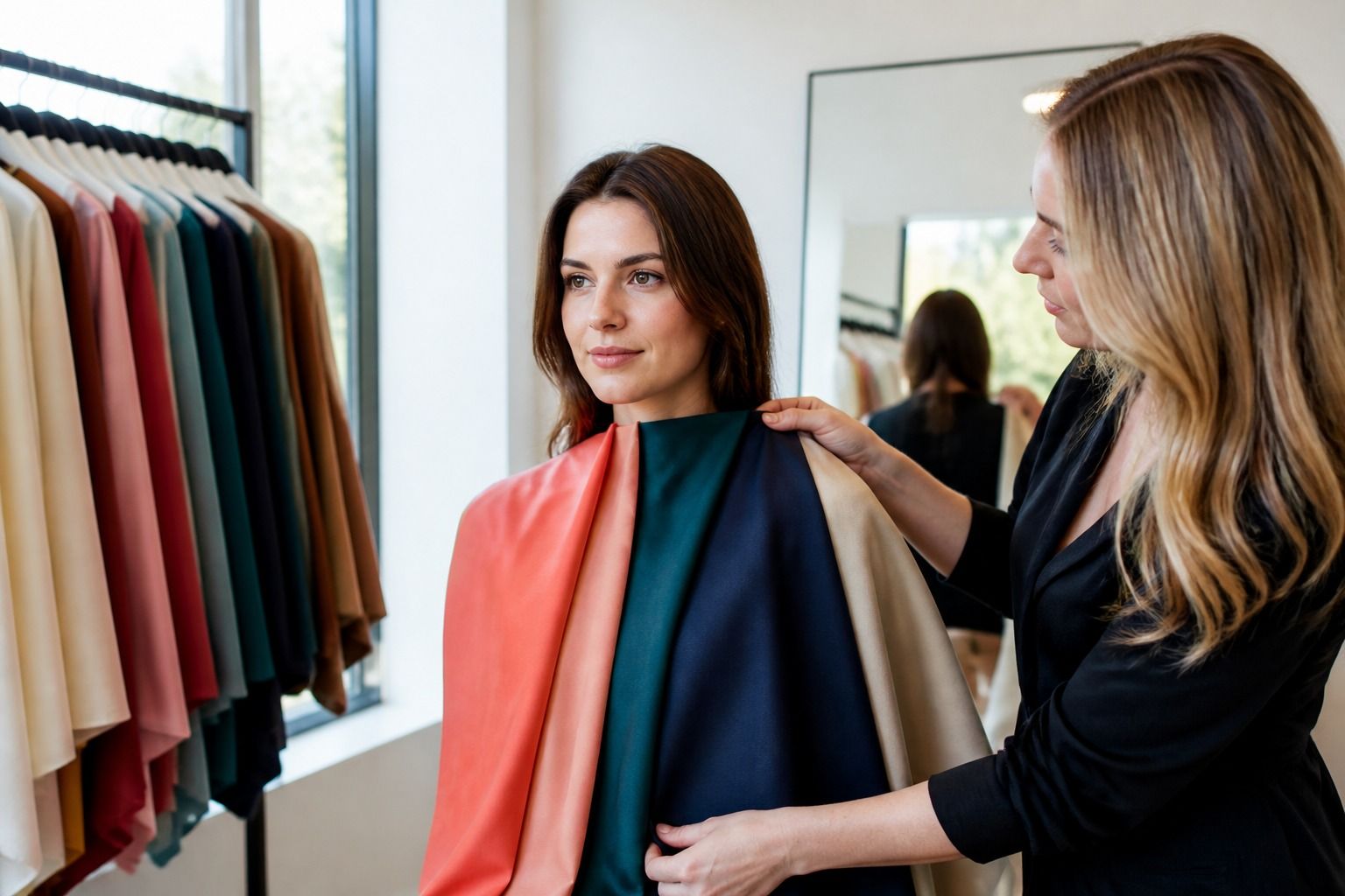
The question 'what colors look good on me' is usually broader than a seasonal palette. You are trying to understand the balance between your features and the color beside them: how much contrast you can carry, whether soft or clear colors feel more natural, and which temperature direction keeps the face from looking uneven. The answer is a working range, not one magic shade.
Start with the contrast in your features
Contrast is the difference between the lightest and deepest parts of your face, hair, eyes, and brows. It affects how much difference between a top and a neutral feels natural. Low-contrast features often settle in outfits where colors are close in depth. Higher-contrast features may need a dark anchor, a clear light, or a stronger color relationship to avoid looking washed out.
You do not need to measure your face with a chart. Compare a soft medium outfit with a high-contrast one and notice which keeps your features visible. If black and white look more like a costume than a frame, lower the contrast. If an outfit of pale beige makes the face fade, add depth or clarity before changing the temperature.
Choose color intensity before naming a season
Chroma describes how clear or muted a color is. Bright red, dusty rose, neon green, and smoky olive may share a family while creating completely different effects. When a color looks wrong, ask whether it is too bright or too grey before deciding that the entire hue is wrong. This single question often opens more useful options.
Try three versions of the same family: a soft, medium, and clear shade. For example, compare dusty blue, regular denim blue, and cobalt. Keep the depth reasonably similar and watch the face. One version may make the eyes look clearer, another may feel heavy, and a third may reflect too much color onto the skin.
Test colors beside the face
Hold clothing at its real neckline and use daylight when possible. Look first at the skin, then the eyes, then the border of the face. A flattering color usually makes the whole face feel more coherent; an unhelpful one may exaggerate redness, create a grey cast, or draw attention to the garment before you notice the person.
Compare colors in pairs instead of trying to remember them. What color looks best on me is easier to answer when you place warm peach next to cool rose, cream next to white, or navy next to black. Keep the fabrics similar, because texture and shine can change the result as much as hue.
Balance strong and quiet pieces
A color does not need to be perfect to be wearable. Strong colors can work in a lower half, outer layer, shoe, bag, or print when the near-face area has a reliable neutral. A quiet color may need a stronger accessory if it makes the outfit disappear. Think in terms of distance and proportion rather than a pass-or-fail list.
If a favorite shade is difficult, reduce its surface area first. Try it as a cardigan left open over a better near-face top, or as a print where the color is interrupted. This keeps the mood of the shade while giving the face a calmer frame. Personal color analysis is more helpful when it offers adjustments, not only exclusions.
Build combinations instead of hunting for one perfect color
A wardrobe works through combinations. Choose a neutral base, a supporting color, and a small accent, then change only one component. If the outfit works when the accent is removed, you have a stable base. If every item needs to be the best color, the palette is too narrow or the contrast is not balanced.
Keep notes on combinations that feel easy. You may discover that the best colors for you are not a group of isolated swatches but a relationship such as soft navy with dusty rose, olive with cream, or charcoal with berry. Those pairings make shopping faster because they tell you what to look for together.
A practical answer to the question
Write down three near-face neutrals, five supporting colors, and two colors you love but prefer farther from the face. Mark whether each is warm, cool, soft, clear, light, or deep. That short list gives you a starting answer without pretending that your wardrobe will never change.
Recheck the list after wearing it in real life. Compliments are not the only evidence, but repeated comfort and the way the face looks in photographs can reveal a pattern. The goal is a calmer choice next time you shop, not a more complicated vocabulary.
Make the answer easy to use
Keep your working answer short enough to remember while shopping. For example: medium-depth colors, softened edges, cool-leaning neutrals, and one clear accent. This type of description is often more helpful than a long seasonal list because it tells you what to notice when the exact color name is unfamiliar.
Use the description to filter choices before you enter the changing room, then let the garment prove itself. A product page may call a shade sage, rose, or navy, but names are inconsistent. Look at the fabric, place it near the face, and compare it with a known good color. Your own reference piece can be more reliable than the label.
Over time, the question becomes less urgent because the pattern becomes familiar. You start to recognize when a color is too bright, too yellow, too dark, or too close to the skin. That is the practical benefit of personal color analysis: a better eye and fewer expensive guesses.
Keep a photo of three outfits that made the face look clear and three that felt off. Compare them later without judging the style or fit first. Often the difference is visible in the color relationship: the difficult outfits may be too close to the skin, too sharp, too yellow, or missing a dark or light anchor.
Repeat the experiment with clothes you already own. You do not need new purchases to test personal color. Move a scarf, jacket, or top near the face, change one color at a time, and ask what changed. This prevents shopping from becoming a substitute for observation.
The answer to 'what colors look good on me' becomes more accurate when it is based on repeated wear. Use online color analysis to suggest questions, then let daylight, fabric, and your own wardrobe provide the final evidence.