A color analysis test can feel strangely official when it gives you a season, a palette, and a neat row of colors. The dangerous part is how quickly that result can turn into a shopping list. Before buying five sweaters in your new best shades, slow down and read the result like a working hypothesis. A good test can point you toward better colors. A rushed one can send you into the same changing-room disappointment with more confidence.
What a color analysis test can actually measure
Most tests look for patterns in undertone, contrast, value, and chroma. A quiz may ask whether silver or gold looks better, whether your hair is ash or golden, or whether bright colors overwhelm you. A photo-based test may read the relationship between skin, eyes, hair, and nearby color. Neither method sees your whole wardrobe, your dye history, your favorite makeup, or the way you dress on a normal workday.
Treat the result as a direction. If the test says Light Spring, it is probably suggesting warmth, lightness, and clarity. If it says Soft Summer, it is pointing toward cooler, muted, medium-light color. If it says Deep Autumn, it expects depth, warmth, and richness. The name matters less than the traits behind it.
A free color analysis can be useful for that first sorting step. It becomes risky when it claims too much. One result cannot prove that every shade in a seasonal palette will suit you, and it cannot decide whether you personally want a quiet wardrobe or a sharper one. Style still gets a vote.
Why the photo setup changes the answer
A color analysis test photo is only as honest as the light in it. Window light is usually the safest choice, especially if you stand facing the window and avoid direct sun stripes across the face. Warm ceiling lights add yellow. Cool bathroom lights can pull the skin gray. A green wall, bright red sweater, or heavily filtered phone camera can shift the entire reading.
Use a bare-face photo if you can. Foundation, bronzer, strong blush, and dyed eyebrows all introduce a second palette. Pull hair back if the color is currently dyed and very different from your natural direction. Wear a plain white, gray, or neutral top, and keep the background quiet. The setup is boring on purpose.
| Photo detail | Better setup | Why it matters |
|---|---|---|
| Light | Face a window in indirect daylight | It reduces the yellow or blue cast that changes undertone |
| Makeup | Use a bare face or very minimal makeup | Color cosmetics can make the test read the makeup instead of the skin |
| Background | Choose white, gray, beige, or another quiet surface | Bright walls and clothes bounce color onto the face |
| Camera | Use the same phone and avoid beauty filters | Filters smooth redness and change contrast |
If your result feels odd, retake the photo before retaking your identity. I have seen people move from Winter to Summer, or Autumn to Spring, just by changing a yellow-lit bedroom selfie for a clean daylight image. That does not mean the system is useless. It means the input was noisy.
How to compare two possible seasons
Borderline results are common. Cool Summer versus Soft Summer. Bright Spring versus Bright Winter. Deep Autumn versus Deep Winter. The useful comparison is not which name sounds more flattering; it is which shared traits keep showing up when colors sit under your face.
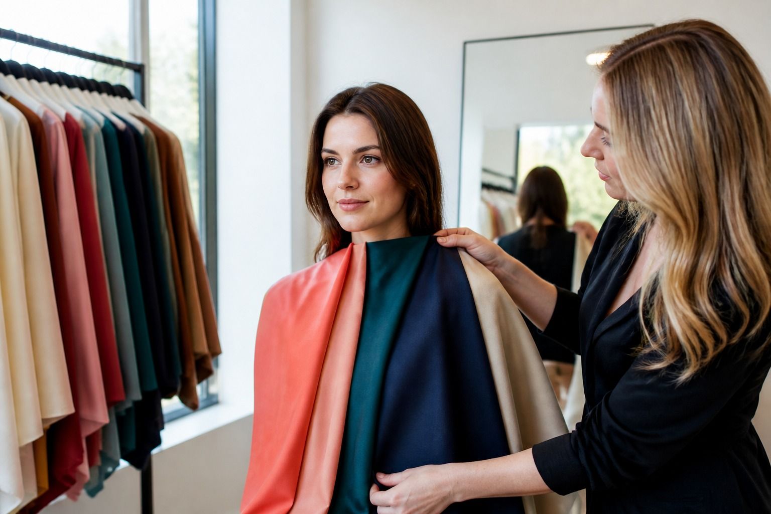
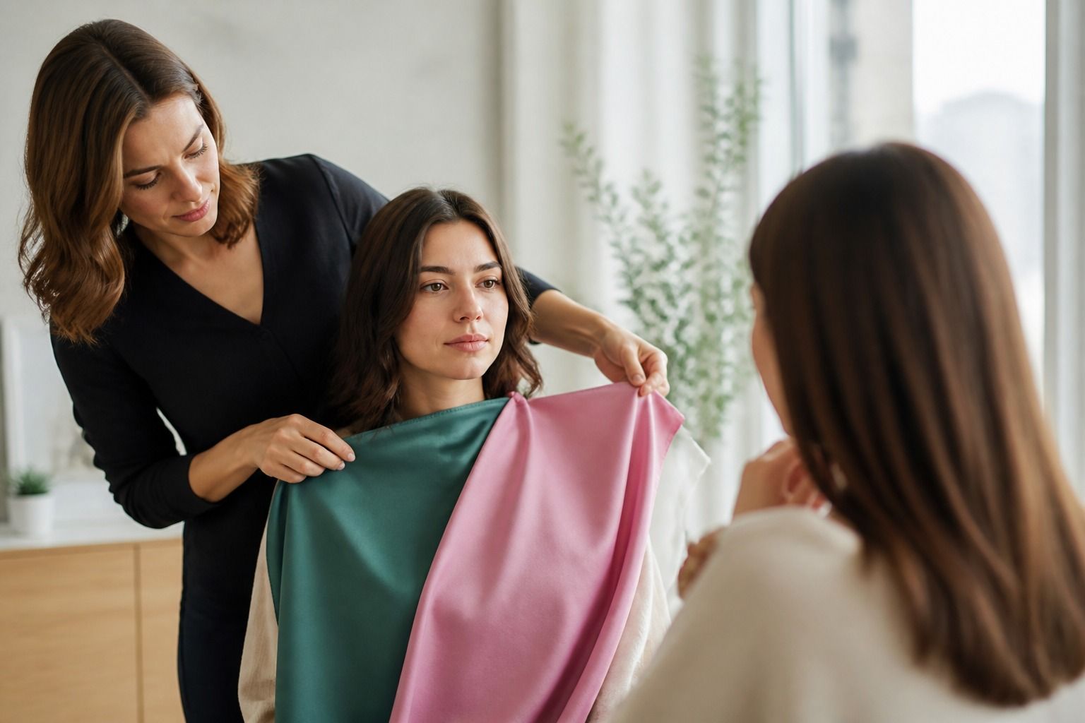
Pick three pairs of fabrics or clothes that separate the options. For Summer versus Winter, compare smoky blue with clear cobalt, soft raspberry with blue red, and charcoal with black. For Autumn versus Spring, compare olive with fresh grass green, rust with coral, and cream with warm bright ivory. For Deep Autumn versus Deep Winter, compare espresso with black, teal with emerald, and warm burgundy with cool wine.
Watch the face, not the fabric. Does the color make the skin look smoother or more tired? Do the eyes look clearer? Does the mouth disappear? Does the jawline sharpen or become shadowy? A good color does not have to create a dramatic glow. Often it simply stops fighting you.
Which result details matter for clothes
The best part of a color palette test is not the prettiest accent shade. It is the set of wardrobe instructions hiding inside the palette: your version of white, your best dark neutral, your safer beige or gray, your useful denim shade, and your lipstick direction. Those choices affect daily outfits more than a rare party dress color.
If the result says you are cool, check white, gray, navy, rose, berry, blue, and plum before buying statement colors. If it says warm, check cream, camel, olive, rust, warm brown, coral, and terracotta. If the result says muted, be careful with colors that look freshly opened from a paint tube. If it says bright, muted clothes may look dusty before they look elegant.
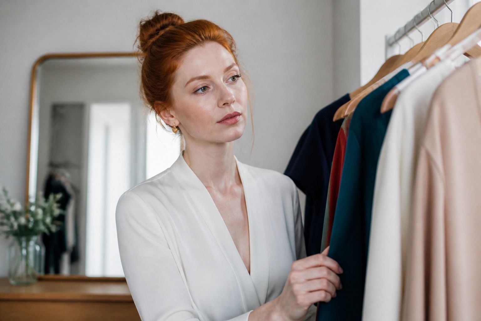
Start with one category. T-shirts are a cheap test. Lipstick is fast but can be misleading if the rest of the face is bare. A scarf is useful because it sits right where color analysis matters most. Coats are expensive, so they should come later, after you have seen the palette work in several smaller pieces.
When to retest and when to stop testing
Retest when the conditions were bad, your hair color changed dramatically, you used a filtered photo, or the result contradicts every reliable piece you own. Also retest if the tool gives a season without explaining the traits. A label without reasoning is hard to use.
Stop when the same direction keeps repeating. If three different checks all point cool, medium, and muted, you do not need a fourth quiz to confirm that neon orange is difficult. Try clothes instead. The dressing room is slower than a quiz, but it tells the truth in fabric, shadow, and proportion.
There is also a point where testing becomes a way to postpone choosing. You do not need the perfect seasonal name to improve your wardrobe. You need enough confidence to buy the better white, skip the beige that drains you, and choose a jacket color that works with your face at 8 a.m. under real light.
How to shop after a test without overcorrecting
Take the result into your closet before taking it to a store. Pull out five pieces that always work and five that never feel right. Look for shared color traits. Are the winners cooler, softer, deeper, clearer, warmer, lighter? Are the failures all too yellow, too gray, too stark, or too pale? This tiny audit makes any color analysis test result more practical.
Then buy one trial piece near the face: a T-shirt, knit, scarf, or lipstick. Wear it twice in daylight and once under the lighting you actually live with, such as office LEDs, winter morning light, or a restaurant bathroom mirror. If it works in those ordinary places, the palette is useful. If it only works in the test image, keep the lesson and question the label.
The cleanest result is the one that helps you make fewer tired purchases. Read the season, test the traits, keep the colors that make getting dressed easier, and let the rest stay theoretical.