The best colors for pale skin depend on more than how light the skin appears. Undertone, contrast, and chroma determine whether a color adds clarity, creates a cast, or makes the face disappear into the outfit. Instead of collecting a universal list, compare colors at the same depth and learn which versions of white, blue, pink, green, and brown support your features.
Why pale skin does not equal one palette
Pale skin can lean warm, cool, neutral, or olive, and the contrast around the face can be low or high. A cool person may suit icy pink while another looks better in warm apricot; a low-contrast person may need softened colors while a high-contrast person can handle black and clean white. Lightness alone cannot answer the question.
Begin by testing the colors that are usually called safe. Compare soft white with bright white, pale pink with dusty rose, and light beige with taupe. Watch whether the face looks clearer or whether the garment creates a white, yellow, or grey reflection. These small comparisons tell you more than a long list of colors for pale skin.
Choose white, beige, and navy by undertone
White can be crisp, blue-based, creamy, or softened by grey. If stark white looks harsh, try soft white, pearl, or a pale cool grey. If cream makes the skin look yellow, move toward stone or balanced ivory. The best light neutral usually supports the face without becoming a bright frame that steals attention.
Navy is useful when black feels too heavy, but navy also ranges from ink-dark to dusty and from cool to slightly green. Compare it with charcoal and deep brown at the same time. One may make the face more even, while another creates a flat or overly warm cast. A neutral that works in several combinations deserves priority.
Use muted colors when contrast is low
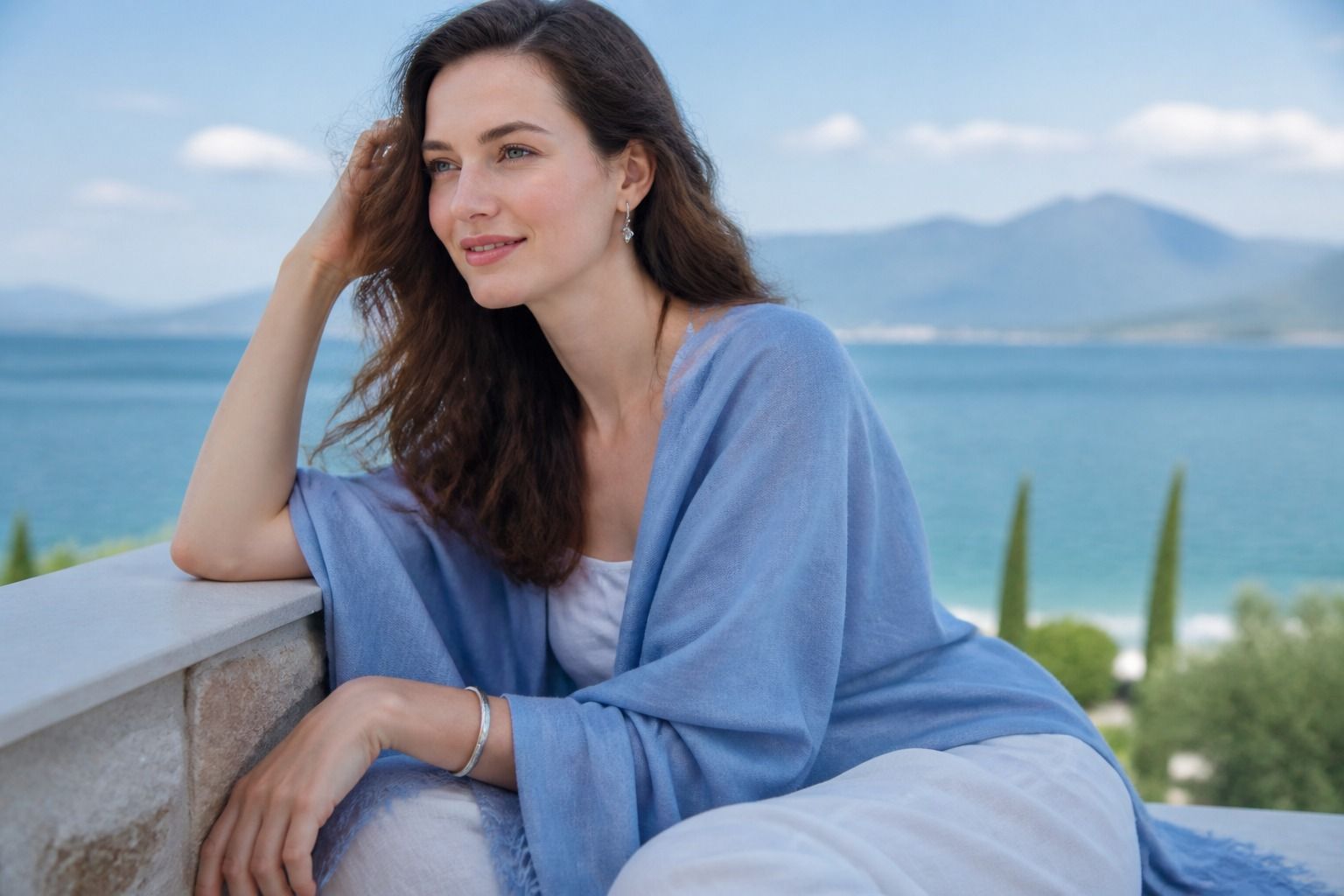
Soft rose, dusty blue, sage, lavender-grey, and muted teal can give pale skin color without making the outfit louder than the face. They are especially useful when the difference between your features is gentle. The exact hue matters less than the amount of grey or softness in it.
If a pastel makes you look washed out, it may be too light rather than too cool. Try a medium version of the same family, such as berry instead of pale pink or blue-grey instead of icy blue. Move one dimension at a time so you can tell whether depth or temperature solved the problem.
Add depth without relying on black
Deep colors can frame pale skin beautifully, but black is only one option. Charcoal, ink navy, deep teal, forest green, plum, espresso, and deep berry can create contrast with less hardness. If you have clear, high-contrast features, the cleaner versions may work best; if your coloring is softer, choose a deep shade with a little grey.
Keep a light element near the face if a dark color feels heavy. A soft white collar, a pale scarf, or a small metal detail can break the block without turning the outfit into high contrast. The right amount of depth depends on the whole face, not on skin lightness alone.
Test color in the fabric you will wear
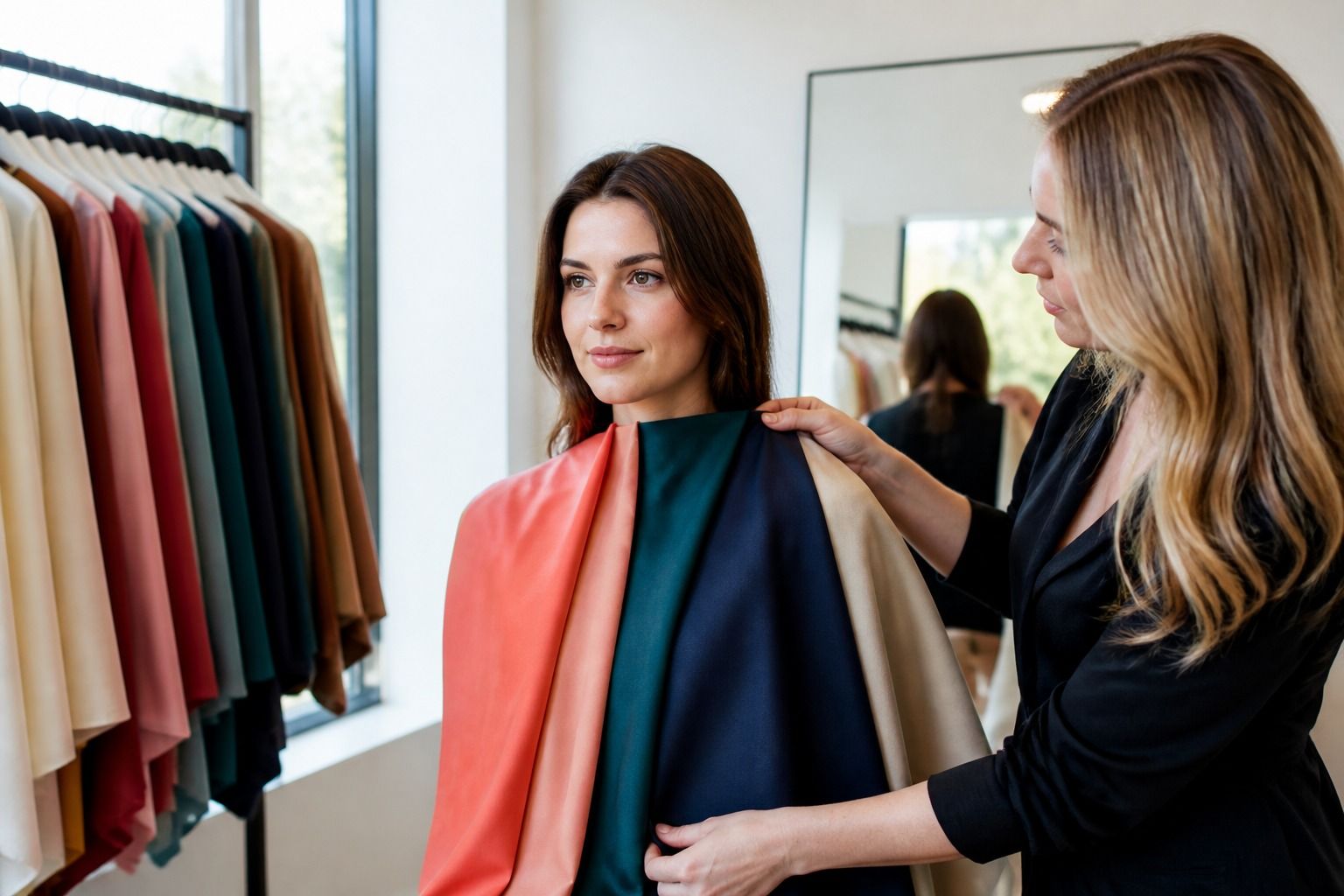
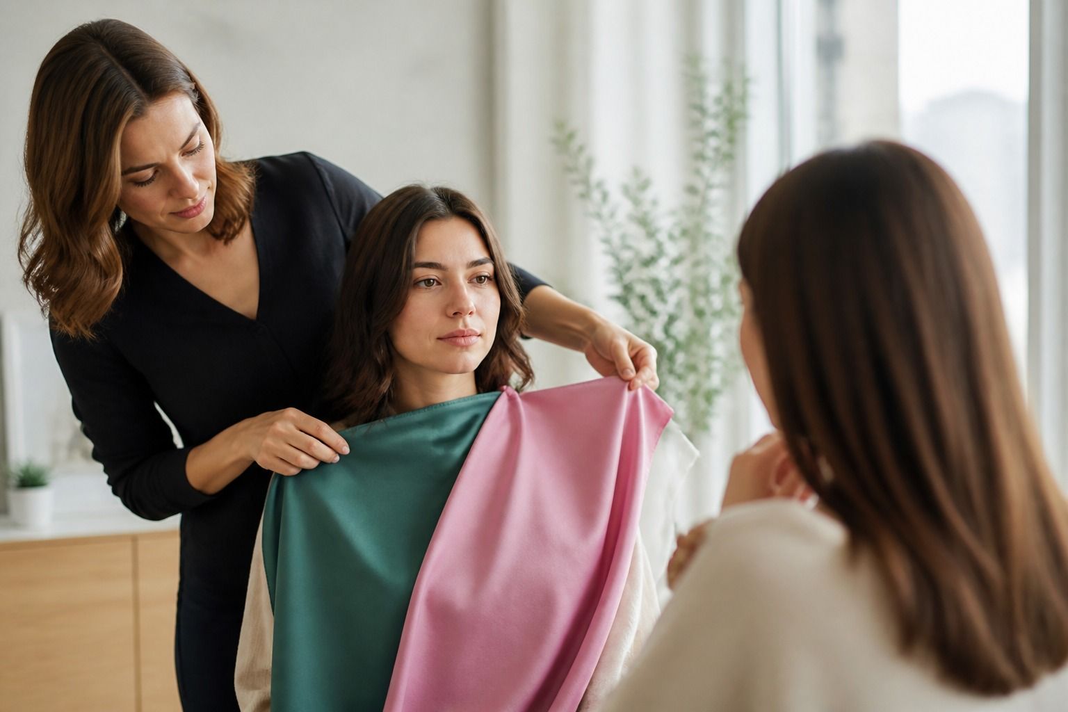
A screen cannot show how much light a fabric reflects. Satin, bright synthetic knits, brushed wool, and matte cotton can make the same dye look completely different. Test the actual garment at the neckline, step into daylight, and compare it with a known reliable color. A flattering shade should still look coherent when you move rather than only when you hold it still.
Also check the distance. A difficult color may work as a skirt, trouser, shoe, or bag, while a strong near-face color may need a layer between it and the skin. This gives you more options than a strict list of colors to avoid and lets you keep shades that express your style.
Build a pale-skin wardrobe beyond safe basics
Choose one light neutral, one medium neutral, one dark anchor, and a small group of accents at different depths. For example, soft white, taupe, navy, dusty rose, teal, and berry create more combinations than a wardrobe built only from black and cream. Adjust the temperature and softness to your own test results.
The best clothing colors for pale skin are the ones you can repeat without constant correction. Save notes on colors that make the face look even in daylight, colors that need makeup or a layer, and colors that work best below the waist. This turns color analysis into a useful shopping filter rather than another rulebook.
Use color distance and proportion
Near-face color deserves the strictest test, but the rest of the outfit can carry more freedom. A warm tan trouser, bright shoe, or deep bag may work beautifully even when the same color is too strong as a top. Think about the amount of color and its distance from the face before removing it from your style.
Prints are another way to use a difficult shade. A pattern breaks up the reflection, especially when one of the colors repeats a reliable neutral. Look at the background color and the scale of the print, not only the brightest mark. A pale face can handle a strong color more easily when the print gives it a clear structure.
This approach keeps the wardrobe from becoming overly cautious. The best colors for pale skin are the colors that help the face when you want that effect, while the rest of the palette can still express mood, season, and personal taste.
A pale face can look clear in both low-contrast and high-contrast outfits, depending on the features around it. Compare a soft white top with grey trousers, then compare a dark navy top with a light neutral. If the first combination feels gentle and the second feels dramatic, the issue may be contrast rather than the skin tone itself.
Use one strong element at a time when you are unsure. A dark coat, a bright lip, or a saturated scarf can frame the face, but several high-impact elements may make the outfit feel louder than intended. Adjust the amount before abandoning the color family.
This gives you a practical way to answer color questions without relying on stereotypes about pale skin. Test the direction, depth, and clarity of the actual garment, then keep the version that makes dressing simpler.