The 16-season system exists because many people do not fit neatly into four classic seasons, or even into the familiar 12-season color analysis map. It gives more room to the small differences that change how clothing looks near the face: undertone, value, chroma, and contrast. That does not mean everyone needs a more complicated label. It means the label should help you choose better colors, not make you memorize a chart that falls apart in a fitting room.
How the 16-season system is organized
Traditional seasonal color analysis starts with four broad families: Spring, Summer, Autumn, and Winter. Spring and Autumn are usually warm; Summer and Winter are usually cool. Spring and Winter tend to look clearer; Summer and Autumn tend to look softer. The 12-season model then divides those families into more specific groups, such as True Spring, Light Summer, Soft Autumn, and Deep Winter.
16 season color analysis adds another layer for people who sit between common groups or need a more precise balance of temperature, depth, and chroma. Different consultants may name the extra seasons differently, but the purpose is similar: to avoid forcing a person into a palette that is nearly right yet slightly too bright, too muted, too warm, too cool, too light, or too dark.
The useful way to read the system is not as a personality chart. It is a set of color tolerances. How warm can a color be before it turns yellow on you? How cool can it be before it looks hard? How much brightness can your face carry? How much darkness gives definition rather than weight? The more expanded system tries to answer those questions with finer edges.
What changes between neighboring seasons
Neighboring seasons can look close on paper and very different on skin. A Soft Summer and a Soft Autumn may both wear muted colors, but one usually needs cooler rose, blue-gray, and soft plum, while the other may come alive in olive, warm taupe, and muted terracotta. A True Spring and a Bright Spring may both need warmth, but Bright Spring can usually handle clearer contrast and sharper color.
This is where people often mistrust the system. They try one color from a season, like coral or navy, and decide the whole result is wrong. The better test is a comparison set. Put a warm muted green beside a cool muted blue-green. Put ivory beside optic white. Put charcoal beside espresso. The difference is easier to see when similar colors compete directly.
| Dimension | What it means in clothing | How a border can show up |
|---|---|---|
| Temperature | How warm, cool, or neutral a color appears | Both cream and white may be imperfect, while soft ivory or oyster works better |
| Value | How light or dark the palette can go | Pastels may feel weak, but black may feel too heavy |
| Chroma | How clear or muted the colors should be | Bright colors look loud, yet dusty colors look tired |
| Contrast | How much separation works between outfit colors | A color is right alone but wrong when paired too sharply |
The expanded model is most helpful when it explains these in-between reactions. It may show that you are not confused; your best colors simply live in a narrower corridor than a broad seasonal label suggests.
Why a quiz can place you near a border
A 16 seasonal color analysis quiz can be useful for learning the language of the system, but it has limits. Most quizzes rely on self-reported features: eye color, natural hair color, skin depth, whether silver or gold looks better, and which colors get compliments. Those answers can be distorted by dyed hair, old habits, lighting, makeup, camera exposure, and the colors you already own.
If a quiz asks what season am I and returns two possible answers, that is not automatically a failure. It may be pointing to a real border. A person might have cool-leaning skin but warmer hair, medium contrast rather than high contrast, or a face that accepts neutral colors more easily than clearly warm or cool ones. The problem starts when the quiz result is treated as final proof instead of a starting point.
Use any seasonal color analysis quiz as a sorting tool. If it suggests Soft Summer, compare that palette against Soft Autumn and True Summer. If it suggests Deep Winter, compare Deep Autumn and Cool Winter. The right result should not need heavy persuasion. In daylight, the better palette usually makes the skin look steadier, the eyes clearer, and the clothing less separate from the person.
How to use a season without over-literal rules
A season is most useful when it narrows your shopping decisions. It is less useful when it turns into a list of forbidden colors. Even a well-chosen palette has levels: best colors near the face, acceptable colors in prints, difficult colors for trousers or shoes, and special-case colors that work with makeup or styling. A good wardrobe uses the system with judgment.
For example, someone close to Soft Summer may keep black trousers because they are practical, but choose navy, pewter, or soft charcoal for coats and tops. Someone in a Spring family may still wear denim, but choose clearer blue rather than gray-washed blue. Someone near Deep Winter may love camel, then realize it works better as a bag than as a sweater under the chin.
The expanded system also helps with prints. A print can technically contain one of your best colors and still fail if the background is wrong, the contrast is too high, or the overall temperature leans away from you. When shopping, step back from individual swatches and look at the whole effect. Does the print sharpen your face, or does your eye keep going to the fabric first?
A practical way to test the palette in clothing
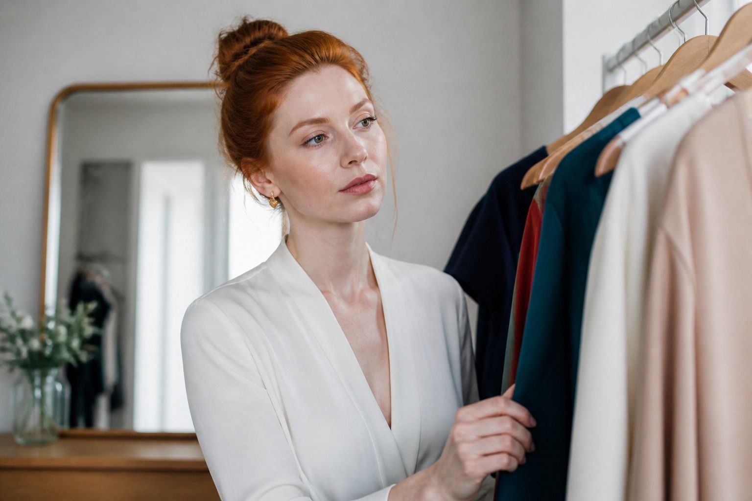
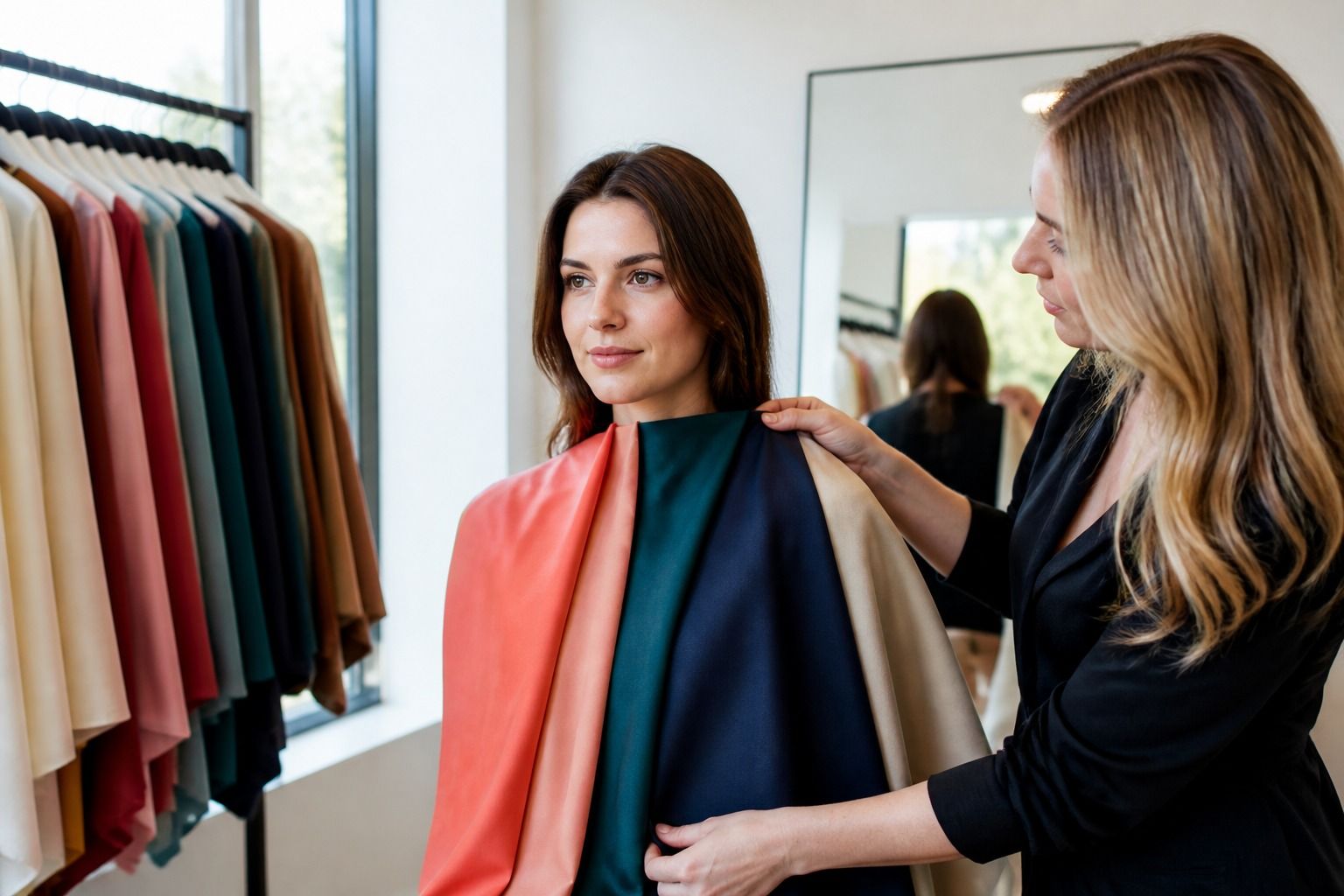
A 16 season color analysis test becomes more reliable when it uses real garments rather than isolated color squares. Choose six comparison pieces: one white or cream, one dark neutral, one medium neutral, one red or pink, one blue or green, and one print. Try to make each comparison close enough that the difference is meaningful. Tomato red against berry red teaches more than tomato red against beige.
Test in indirect daylight with minimal makeup and your hair away from your face if it is dyed. Take quick photos, but do not trust the camera alone; phone processing can warm, cool, brighten, and smooth the image. Look in the mirror first. Notice shadows around the mouth, redness around the nose, grayness under the eyes, and whether the color seems to sit with your features or in front of them.
Then build two small outfits from the most convincing colors. A palette that only works as swatches is not finished. If the colors create outfits you would actually wear, the system is doing its job. If the palette looks pretty but every outfit feels unlike you, adjust the season rather than forcing yourself into a costume.
What the expanded system adds in real life
The main benefit of 16-season color analysis is precision, not complexity for its own sake. It can explain why True Spring is close but slightly too warm, why Soft Summer is gentle but too gray, or why Deep Winter gives structure while the brightest Winter colors overpower. That kind of detail can save money because it reduces almost-right purchases.
The risk is overfitting. If the label becomes so narrow that you are afraid to buy a navy sweater without checking four charts, the system has stopped helping. Your palette should make decisions faster: which neutrals to prefer, which metals are easiest, which lipstick families support the face, which prints deserve a second look, and which sale colors are probably not worth the compromise.
Use the expanded season as a working hypothesis. Test it in fabric, refine it with outfits, and keep the colors that repeatedly make you look more like yourself. The best seasonal result is not the most elaborate one. It is the one that turns color from a guessing game into a quiet, practical habit.
Record what happens after the quiz
After a 16 season color analysis quiz, choose three colors from the suggested season and three from a neighboring season. Wear or drape them under similar conditions and write down what changed. Look for a consistent difference in clarity, depth, or temperature rather than a single moment when one color looked more exciting.
Photographs can help if you use them cautiously. Take the same face, angle, and light, and compare the images later without editing. The point is not to make a social-media-perfect portrait. It is to see whether the eyes, skin, and outline of the face remain coherent when the color changes. A photo is evidence, not an authority.
When the evidence remains mixed, use the overlap. Choose the shared neutrals and medium colors, then keep the distinguishing accents limited until you have more experience. A flexible border palette is often easier to wear than a confident but inaccurate label, especially when you are building a wardrobe from scratch.