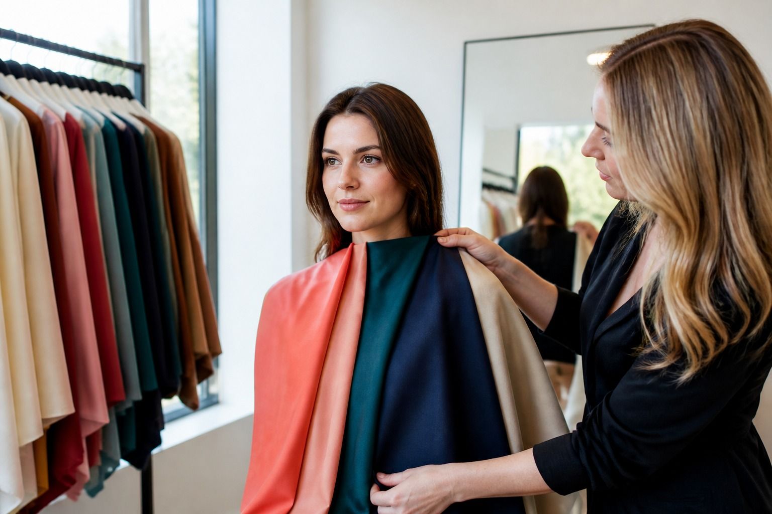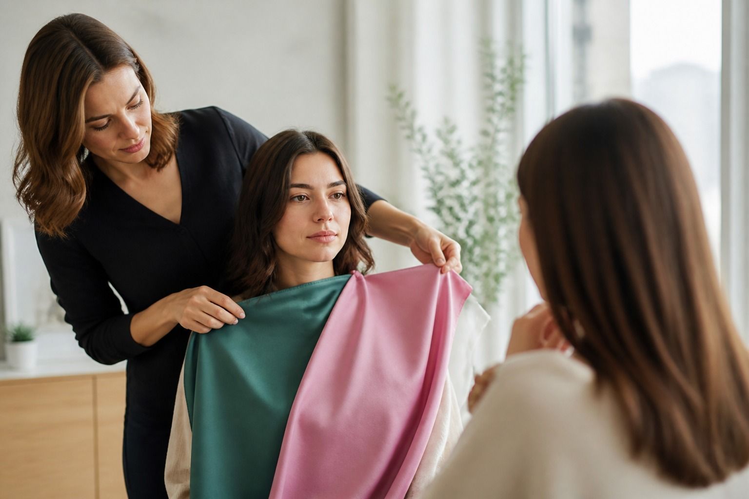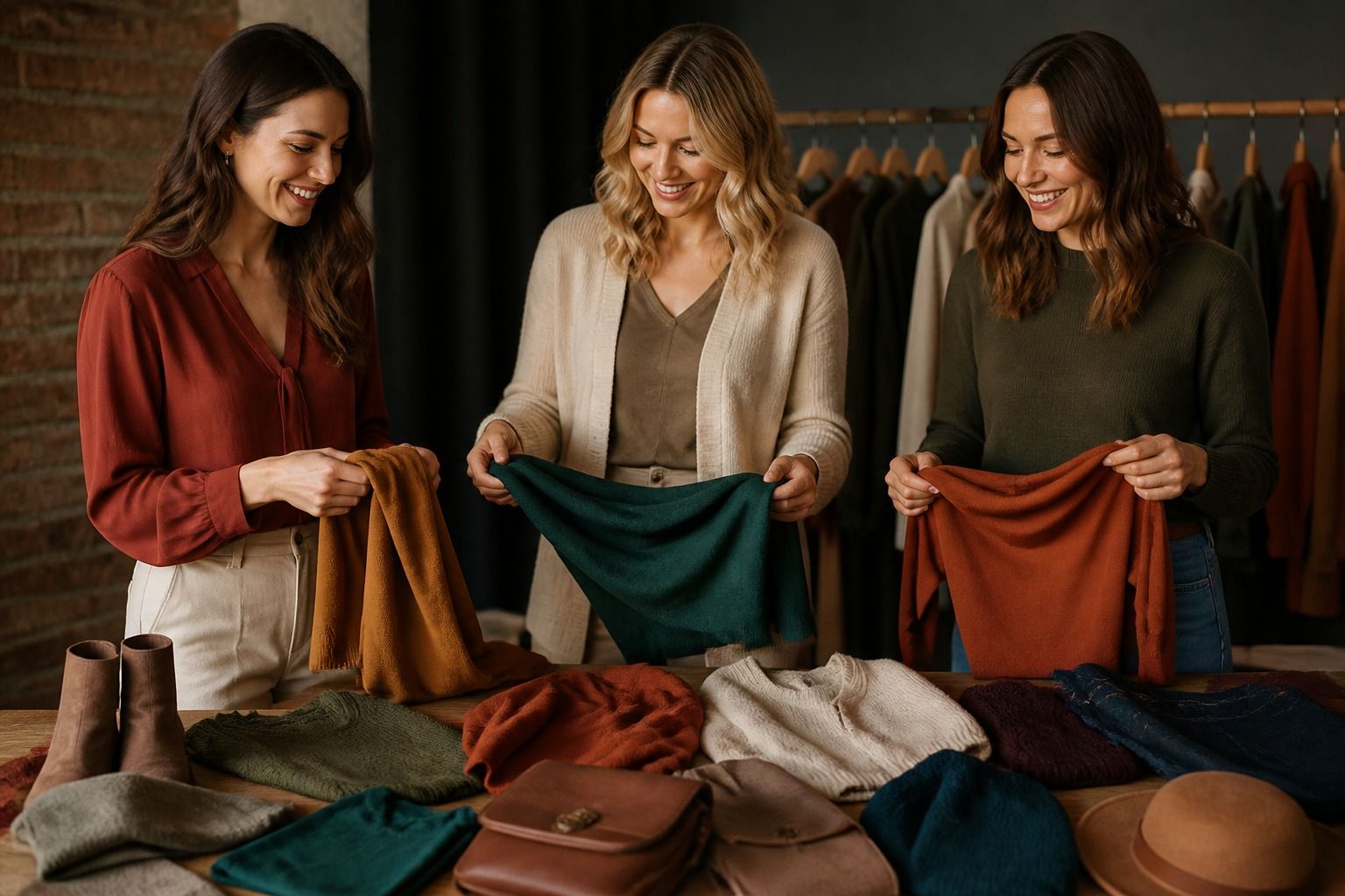
A Warm Autumn color palette is built from warmth, earthy depth, and colors that feel grounded rather than icy or blue-based. It can include camel, rust, olive, terracotta, warm teal, and cinnamon, but the useful question is how much depth and clarity your own features can carry. The palette should support real outfits, not turn every day into a themed costume.
How Autumn palettes are organized
Autumn palettes share warmth but can differ in depth and softness. Warm Autumn is usually clearer and more golden than Soft Autumn, while Deep Autumn carries more depth and can handle darker, richer colors. The names vary across systems, so look for the qualities that repeat: warmth, earthiness, and a controlled relationship between color and contrast.
Compare nearby options rather than memorizing a list. Warm rust against cool berry, golden olive against blue-green, and camel against taupe can show whether warmth is the main direction. Then compare lighter and darker versions to see whether depth or softness matters just as much.
Choose warm colors without making them heavy
Warm colors can become visually dense when every piece is dark, saturated, and textured. Balance rust with cream, olive with soft white, or terracotta with denim. A lighter bridge allows the warmth to remain visible without making the outfit feel closed in.
If orange-based colors feel too strong, move toward warm rose, cinnamon, muted coral, or warm teal. These shades keep the temperature but change the intensity. Color analysis is easier when you adjust one dimension at a time instead of deciding that the whole Autumn family is wrong.
Compare Warm, Deep, and Soft Autumn
Warm Autumn needs the clearest warm direction, Deep Autumn needs more depth, and Soft Autumn needs more mutedness. A golden camel may work well for Warm Autumn, a dark olive for Deep Autumn, and a dusty mushroom-brown for Soft Autumn. The same family can appear in all three palettes with different balance.
Use fabric and lighting carefully. A polished rust can look much brighter than a brushed rust, and store lighting can add yellow to every brown. Compare the shades in indirect daylight and watch how the face changes. The best result usually looks steady rather than dramatically transformed.
Build neutrals beyond brown
Brown is useful, but an Autumn wardrobe needs more than one family of neutrals. Camel, oatmeal, warm grey, olive, cream, denim, and deep teal can make the palette easier to combine. Choose a light, medium, and dark anchor before adding more accents.
Check whether the neutral works with the clothing you own. A beautiful camel that cannot pair with your shoes or coat may create more decisions than it solves. A slightly less perfect olive or warm navy can be more valuable when it connects several outfits.
Use rust, olive, and teal in balance
Rust and terracotta bring warmth, olive adds a grounded green direction, and warm teal gives an Autumn palette some cooler depth without becoming icy. Use one as the main color and let the others support it. A rust knit with cream and olive accessories often feels more settled than rust with several competing warm accents.
If an accent is too strong near the face, move it lower or interrupt it with a pattern. A scarf with rust, cream, and denim may be easier than a solid rust turtleneck. Proportion changes the result and gives you ways to keep colors that express your style.
Use Warm Autumn in everyday outfits
For casual clothes, start with denim, camel, olive, cream, and a warm brown. For work, add deep teal, terracotta, and a restrained rust. For evening, use deep olive, cinnamon, warm burgundy, or a dark brown rather than defaulting to black if black creates a hard edge.
Texture can support the palette, but it should not become a substitute for color balance. Wool, suede, corduroy, and brushed cotton naturally reinforce the earthy direction; shiny fabric may intensify warmth. Check the surface before rejecting or buying a shade.
Keep the palette flexible at the borders
If Warm Autumn overlaps with Deep Autumn, keep the warm neutrals and borrow depth in jackets or evening pieces. If it overlaps with Soft Autumn, borrow muted versions for relaxed outfits. If Soft Summer appears nearby, compare whether the face needs warmth or simply softness. Border comparisons make the palette more personal.
A Warm Autumn color palette is doing its job when you can recognize useful warmth without overthinking every outfit. Keep the colors that make the face and wardrobe feel grounded, use uncertain shades at a distance, and let preference decide the final details.
A Warm Autumn palette should connect with the clothes you already own. If your wardrobe is mostly denim, black, and grey, begin with warm cream, olive, rust, and a warm teal that can bridge those pieces. You do not need to replace everything to introduce a different color direction.
Test strong warm colors near the face before investing in large garments. A color that feels beautiful in a swatch may create too much yellow reflection in a sweater, while the same shade can work perfectly in a bag or trouser. Distance and proportion are part of the analysis.
Keep the final list short enough to shop from. Three reliable neutrals, four supporting colors, and two expressive accents are plenty. Warm Autumn becomes practical when it helps you recognize earthy warmth in real fabric and build combinations you will actually repeat.
A small color journal can show whether warmth is really helping. Photograph a few outfits in daylight, then note which colors make the face look steady and which need extra makeup, stronger contrast, or a layer. Repeated evidence is more useful than the memory of a single good mirror moment.
Warm Autumn is not a demand to wear orange or brown every day. It is a direction toward grounded warmth, with enough flexibility for denim, cream, teal, olive, and muted berry. Keep the qualities that make the face look connected and leave the rest as optional accents.