An undertone test is useful only when it slows you down. A quick glance at your wrist or one photo in a bathroom mirror can send you in the wrong direction, especially if your surface skin is flushed, tanned, freckled, or simply lit by a yellow bulb. The point is not to prove that you are warm, cool, or neutral in five seconds. The useful question is quieter: which colors make your skin look steadier, clearer, and more like itself when the fabric is near your face?
Start with what undertone means in real clothing
Undertone is the color bias that seems to sit underneath the surface of your skin. It is different from how light or deep your skin is, and it is different from temporary redness after a shower, sun exposure, or a cold walk. In personal color analysis, warm undertone usually leans golden, peach, olive, or yellow. Cool undertone usually leans pink, red, blue, or violet. Neutral undertone sits closer to the middle, or carries warm and cool notes at the same time.
This matters most near the face. A camel coat can look elegant on one person and oddly dusty on another. A blue-white shirt can make one face look crisp and rested, while the same shirt makes another face look gray around the mouth. That is the kind of evidence an undertone analysis should collect. It is less about naming your skin and more about noticing what the color is doing beside it.
Before testing, remove the obvious distractions. Use natural daylight, not direct sun and not a warm vanity bulb. Pull bright lipstick away from the face. If your hair is dyed a strong copper, black, platinum, or violet, cover it with a neutral towel for a few minutes so it does not vote louder than your skin. I also like testing on a day when the skin is ordinary, not irritated from exfoliation or bronzed after a beach weekend.
Use the vein test, but do not let it decide alone
The vein test is popular because it is easy. Look at the veins on the inside of your wrist in daylight. If they appear blue or purple, many guides call that cool. If they appear green, the usual answer is warm. If they look blue-green, hard to read, or different from one wrist to the other, neutral becomes more likely. This is why searches for blue veins undertone can be so frustrating: the veins are rarely as clear as the diagrams make them look.
There are several reasons. Skin depth changes how veins show through. Olive skin can make veins look greener even when the overall palette does not behave warmly. Redness across the hands can turn everything pink for an hour. A phone camera can also exaggerate blue and green depending on its automatic white balance. If you are doing a skin undertone test with a photo, include a plain white sheet of paper in the frame and check the result in more than one room.
Treat the vein test as one clue, not a verdict. When wrist veins say cool but cream fabric is kinder than optical white, keep testing. When veins say warm but orange lipstick looks heavy and a soft berry looks cleaner, keep testing. Good color work is allowed to be mildly inconvenient. The awkward middle is often where the correct answer starts to appear.
Compare metals, whites, and nearby colors
The metal test is more useful when the jewelry is simple. Put a clean silver chain or earring on one side of the face and a plain gold piece on the other. Avoid stones, texture, heavy shine, and trendy shapes. You are not judging which object is prettier. You are looking at the skin. Does gold make the face look warmer and more rested, or does it turn the skin yellow? Does silver sharpen the eyes, or does it pull shadows forward?
Then test white versus cream. Hold a true white shirt, towel, or pillowcase under the chin, then switch to ivory, cream, or oatmeal. Cool undertones often handle clear white better. Warm undertones often settle beside cream. Neutral undertones may be fine with both, but not equally fine with the extremes. A neutral person might wear soft white beautifully and still look tired in stark paper white.
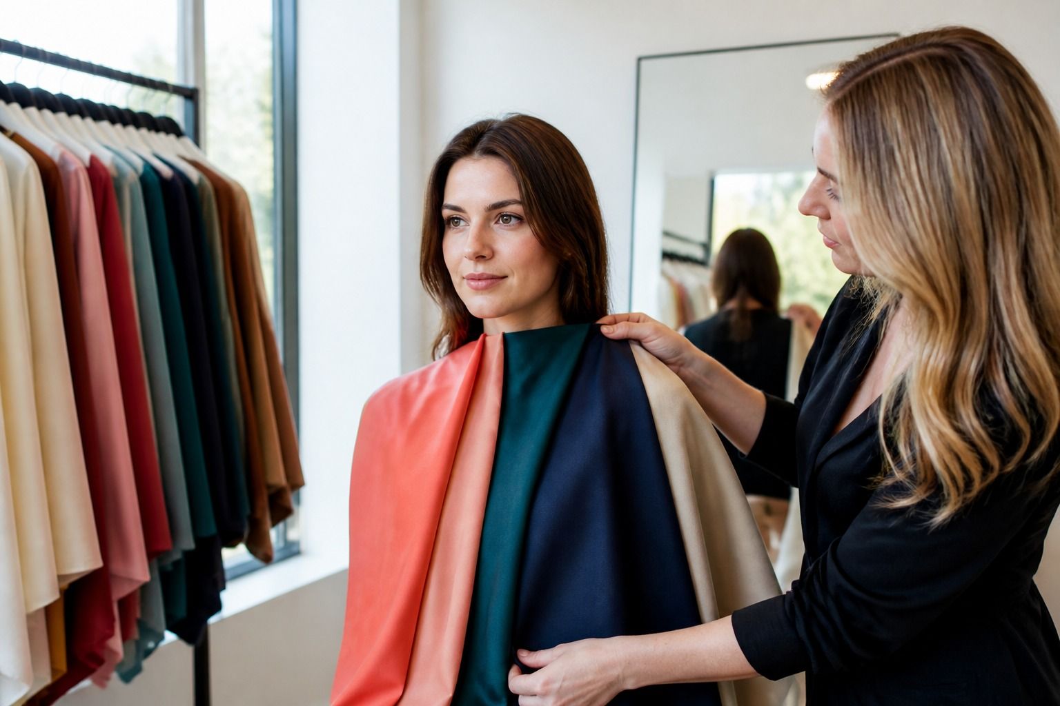
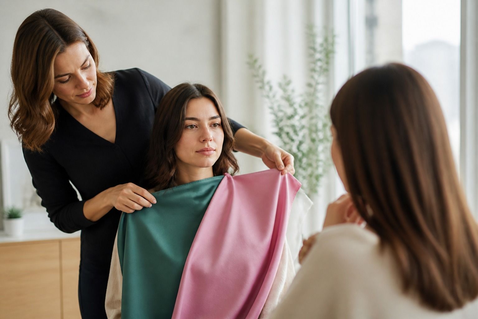
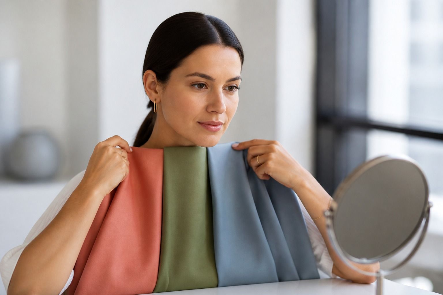
Nearby colors are the quietest and sometimes the most honest test. Compare tomato red with blue red. Compare coral with rose. Compare mustard with muted olive. Compare icy pink with dusty mauve. If a color makes the skin look separate from the face, almost like the fabric is wearing you, mark it as a warning. If it makes the eyes seem clearer and the jawline less shadowed, mark it as useful. You do not need a professional draping kit for a first pass. A scarf drawer, laundry basket, or changing room can tell you plenty.
| Test | Warm signal | Cool signal | Neutral or mixed signal |
|---|---|---|---|
| Veins in daylight | More green than blue | More blue or violet | Blue-green, unclear, or inconsistent |
| Metals near face | Gold looks easy and skin looks healthier | Silver looks clean and lifts the face | Both work, but very yellow gold or icy silver may feel too strong |
| White fabric | Cream, ivory, or oatmeal looks softer | Clear white looks fresher than cream | Soft white works better than either extreme |
| Color pairs | Coral, tomato, camel, warm olive | Berry, blue red, charcoal, cool navy | Balanced rose, teal, taupe, soft navy |
Read red, yellow, and olive casts without panicking
Red undertone skin is not always cool. Sometimes redness is surface color: rosacea, sensitivity, heat, acne marks, or a flush after exercise. If your cheeks are pink but your neck and chest look golden, a cool palette may fight the rest of you. In that case, test colors against the neck and lower face as well as the cheeks. The goal is balance, not matching the loudest patch of skin.
Yellow undertone skin is also easy to misread. Some people with a yellow cast need warm colors, yes. Others need cooler or softer colors because very warm shades make the yellow look stronger. Mustard is a helpful troublemaker here. On a truly warm person it can look intentional and grounded. On someone who only has surface yellowness, it can make the complexion look flat, especially under the eyes.
Olive skin deserves patience. It can look greenish, golden, gray, or muted depending on the light, and it often produces mixed signals in simple tests. Very warm orange may be too loud, while icy lavender may look separate. Many olive-leaning people do better with softened colors: muted teal, pine, cocoa, taupe, rose brown, soft navy. If the usual warm versus cool answers keep failing, pay attention to clarity and softness as much as temperature.
Recognize neutral signals and mixed evidence
A neutral undertone does not mean every color works. It means temperature is not the only thing deciding the outfit. You may be able to wear both gold and silver, but prefer brushed gold over bright yellow gold and soft silver over chrome. You may wear both cream and white, but only when the fabric has the right texture or depth. Neutral skin often reacts more strongly to value and chroma: how light, dark, clear, or muted the color is.
Mixed evidence is common. Blue veins with a golden neck. A cool pink cheek with warm freckles. Silver jewelry that looks fresh in winter and gold that looks better with a summer tan. None of this ruins the test. It simply means the answer should be practical. If you are asking what is my undertone because you want to buy foundation, hair color, or a wedding outfit, gather evidence from the exact decision you are making. A foundation match needs jaw and neck checks. A wardrobe palette needs fabric near the face. Hair color needs comparison against eyes, brows, and the colors you actually wear.
I would be suspicious of any result that makes your whole wardrobe feel impossible. A good undertone test usually explains patterns you already half noticed: why camel sat unworn, why charcoal became a reliable jacket, why coral lipstick looked cheerful in the tube and strange on the face. The right answer tends to reduce confusion, not create a new costume.
Use undertone as a direction, not a life sentence
Once you have a likely direction, test it gently. If warm signs dominate, try cream instead of stark white, gold instead of chrome silver, tomato red instead of blue red, olive instead of icy mint. If cool signs dominate, try soft white, silver, berry, charcoal, blue red, and navy. If neutral signs dominate, stay away from the harshest extremes first: neon warmth, icy pastels, very yellow beige, and flat gray can all be tricky for different reasons.
The smartest next step is a small color rack, not a shopping spree. Pull six pieces you already own and sort them into easy, passable, and draining. Look at them in daylight near a window. Take a plain selfie if it helps, but trust the mirror more than the phone. Cameras love to smooth away exactly the shadows and color casts you are trying to notice.
Undertone is a direction for better comparisons. It should help you choose between two shirts, two lip colors, two metals, or two versions of beige. It should not make you afraid of color. If a supposedly wrong shade makes you look awake and comfortable, keep it. Real wardrobes are built from evidence, repetition, and a little stubborn personal taste.
Create a repeatable undertone check
A repeatable undertone check needs the same three conditions each time: indirect daylight, a neutral background, and colors that are similar in depth. Compare a cool and warm option that are both medium rather than pairing pale pink with dark rust. This keeps the eye from mistaking contrast for temperature and makes the result easier to interpret.
Ask another person what they notice, but do not hand over the decision completely. Someone else may spot a grey cast or a strong yellow reflection that you have stopped seeing, while your own comfort tells you whether the color feels natural. Combine outside observation with your own side-by-side tests instead of choosing the shade that gets the most enthusiastic comment.
Once a direction repeats, move on to clothing. There is no prize for proving an undertone through every available test. Use the clue to compare neutrals, metals, and near-face colors, then let the wardrobe show you whether the rule is helpful. If it makes shopping easier, keep it; if it creates more anxiety than clarity, simplify the rule.