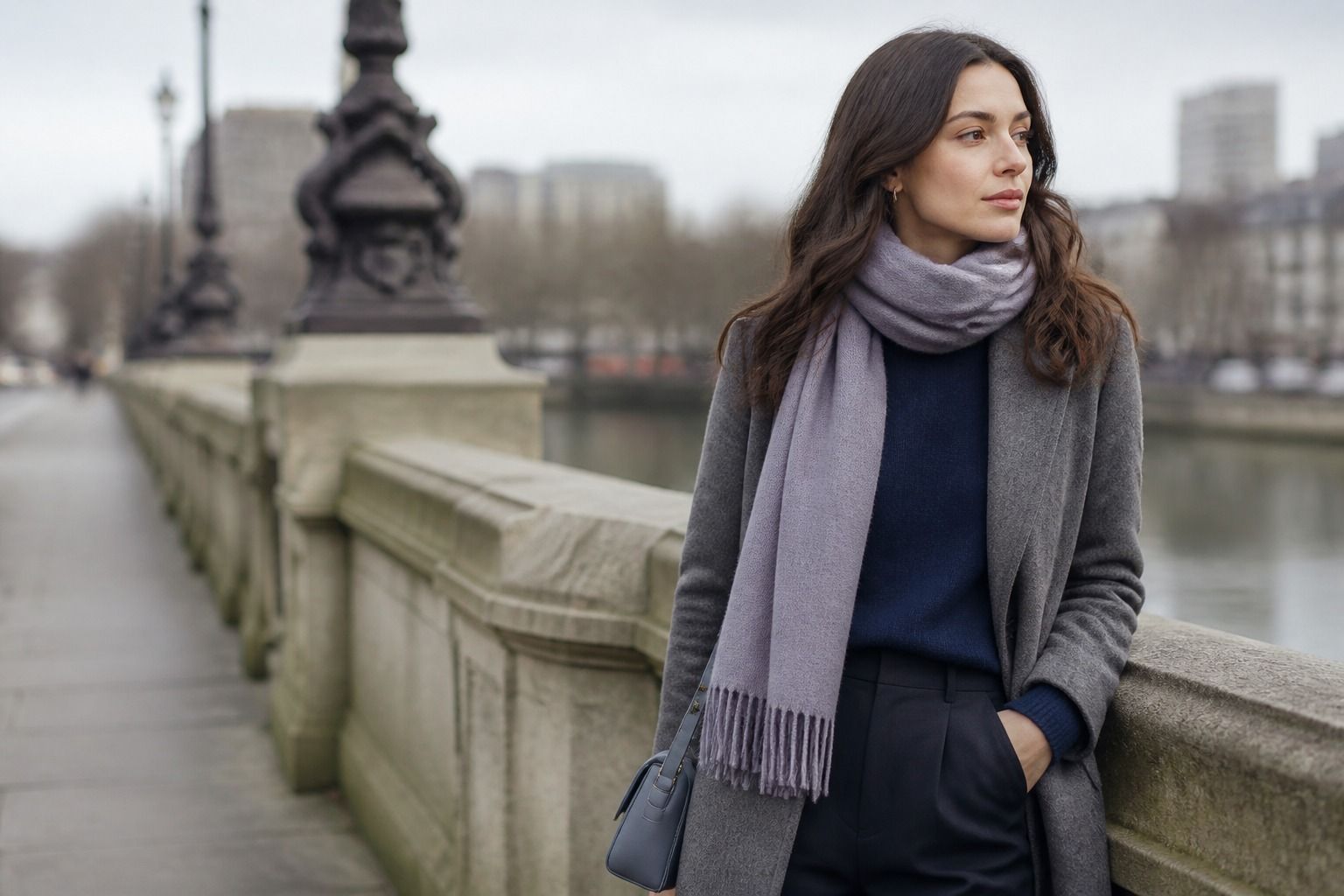
The Soft Winter color palette is for cool coloring that needs definition, but not the full glare of the brightest Winter shades. It keeps the Winter family’s coolness and depth, then softens the brightness enough for everyday clothes. If black and optic white are close but a little harsh, while dusty Summer colors feel too quiet, Soft Winter is the middle ground to test.
How Soft Winter differs from other Winter palettes
Classic Winter palettes are known for clean contrast: black, white, jewel tones, crisp navy, sharp red. Soft Winter keeps some of that structure, but turns the volume down. The colors are still cool. They are still clearer than most Summer shades. Yet they have a slight smoky quality, as if the edge has been softened by charcoal rather than lit by neon.
This is why Soft Winter can be confusing in a fitting room. A bright cobalt blazer may technically belong to the broader Winter family, but it can arrive before the person wearing it. A smoky ink blue jacket often looks more controlled. A pure magenta lip may look theatrical at noon; raspberry, wine, or cool rosewood usually gives color without taking over the face.
Soft Winter is not simply dark Summer. It needs more value contrast than Soft Summer and usually handles deeper anchors better: charcoal, blackened navy, cool espresso, deep pine, and blue-based burgundy. The trick is to avoid both extremes. Too muted and the face loses energy. Too bright and the clothes become the event.
Choose dark neutrals that do not overpower
Dark neutrals do most of the work in a Soft Winter wardrobe. Charcoal is often easier than flat black. Ink blue is usually better than a warm navy. Soft white works better than a hard paper white, especially in shirts, knits, and coats worn close to the face. Cool taupe can appear too weak if it is used alone, but it can be useful as a trouser, bag, or bridge color.
When testing black, look at the shadows it creates. If black makes the under-eye area look heavier or the skin look thin, try charcoal or a blackened blue. You may still wear black leather shoes, belts, or bags. The question is whether a large black block near the face makes you look sharper or simply tired. Soft Winter usually wants definition with a little air around it.
Texture matters because many Soft Winter colors are deep. A matte charcoal coat can look elegant; a very shiny black satin shirt may look severe. Brushed wool, crepe, ribbed knit, suede, and pebbled leather soften the surface without warming the color. That small difference can make a dark outfit wearable during the day rather than reserved for evening.
Use cool accents with controlled brightness
Soft Winter accents are cool, saturated enough to wake up the face, but not fluorescent. Raspberry, cranberry, cool rose, blue-red, plum, pine green, petrol, and stormy teal are good places to start. A color can be lively and still belong to this palette if it has depth or a smoky cast. The unreliable shades are usually orange-red, warm coral, bright lime, camel, and golden mustard.
A practical test is to compare two lip colors or scarves. Try a clear hot pink beside a deeper raspberry. If the hot pink makes the skin look grey or the mouth look separate, it is probably too bright. If raspberry sharpens the eyes and still feels believable with normal clothes, it is closer to the soft winter palette. The same test works with green: emerald may be too clean, while cool pine or blue spruce can look rich without shouting.
Accent placement can be small. A burgundy knit under a charcoal blazer, a petrol scarf with a soft white shirt, or a raspberry lip with an ink blue sweater gives enough color. You do not need every garment to announce the season. In fact, Soft Winter often looks best when one accent is allowed to be the clear note and the rest of the outfit supports it.
Compare Soft Winter with Soft Summer
Soft Winter and Soft Summer both avoid warm earthiness and both dislike neon brightness. The difference is depth and contrast. Soft Summer usually looks best when the whole outfit stays close in value. Soft Winter can handle a stronger dark-light relationship, especially with charcoal, ink blue, and deeper berry shades. If Soft Summer feels graceful but a bit faded on you, Soft Winter may explain why.
| Wardrobe question | Soft Winter answer | Soft Summer answer |
|---|---|---|
| Best dark anchor | Charcoal, ink blue, blackened navy, cool espresso | Smoked navy, slate, soft charcoal, blue grey |
| Best white | Soft white, cool ivory without yellow, icy grey-white | Off-white with grey or pink cast, dove grey light |
| Accent strength | Raspberry, cranberry, pine, petrol, blue-red | Dusty rose, mauve, eucalyptus, soft teal |
| Print contrast | Medium contrast with blurred edges | Low contrast and misty edges |
The comparison is easiest with the same outfit formula. Put on a soft white top and charcoal jacket, then add either dusty mauve or raspberry. If dusty mauve looks polite but weak, and raspberry makes the face look clearer, Soft Winter is more likely. If raspberry seems loud and dusty mauve looks calm and expensive, Soft Summer may be the better home.
Build combinations for everyday wear
Soft Winter clothing works well when the outfit has one dark anchor, one cool light, and one controlled accent. Charcoal trousers with a soft white knit and raspberry earrings. Ink blue denim with a petrol blouse and blackened navy coat. A cool espresso skirt with a wine cardigan and pewter jewelry. These combinations have contrast, but the contrast is not as stark as black, white, and primary red.
For office dressing, replace harsh black-and-white formulas with softened versions. A charcoal suit, soft white shell, and cranberry lip will usually feel more natural than black suiting with a brilliant white shirt. For casual clothes, use deep denim, grey knitwear, blue-based reds, and cool greens. Avoid letting every casual basic drift warm: cream tees, camel coats, tan sandals, and gold hardware can slowly pull the whole wardrobe away from the palette.
Prints should have enough definition to avoid looking washed out. A blurred charcoal-and-soft-white check, a petrol and navy floral, or a wine and grey geometric can work. Tiny low-contrast prints may read too Summer-like, while hard black-and-white graphics may be too sharp. If the print looks better from across the room than near your face, it may be relying on contrast more than harmony.
How to test the palette before buying more
Before buying a new wardrobe, test the Soft Winter color season with clothes you already own. Pull together a charcoal or ink blue piece, a soft white or cool light grey piece, and two accents: one raspberry or wine, one cool green or petrol. Wear the combinations in daylight and take quick photos. The goal is not perfection. You are looking for the pattern: clearer eyes, steadier skin, and clothes that look intentional without looking loud.
If a color nearly works, name the problem. Too warm is different from too bright. Too dark is different from too clean. A blue-red dress may be excellent in color but too shiny in fabric. A charcoal sweater may be right in value but too heavy at the neckline. Soft Winter is a precise palette, but it should make dressing simpler, not turn every purchase into a courtroom case.
Keep the pieces that earn repeat wear. A good Soft Winter capsule might include charcoal, ink blue, soft white, raspberry, petrol, wine, and pewter. Add black carefully if it genuinely sharpens you. Skip camel unless it is far from the face or balanced by cool colors. The finished wardrobe should feel cool, defined, and slightly softened, as if Winter learned to lower its voice.