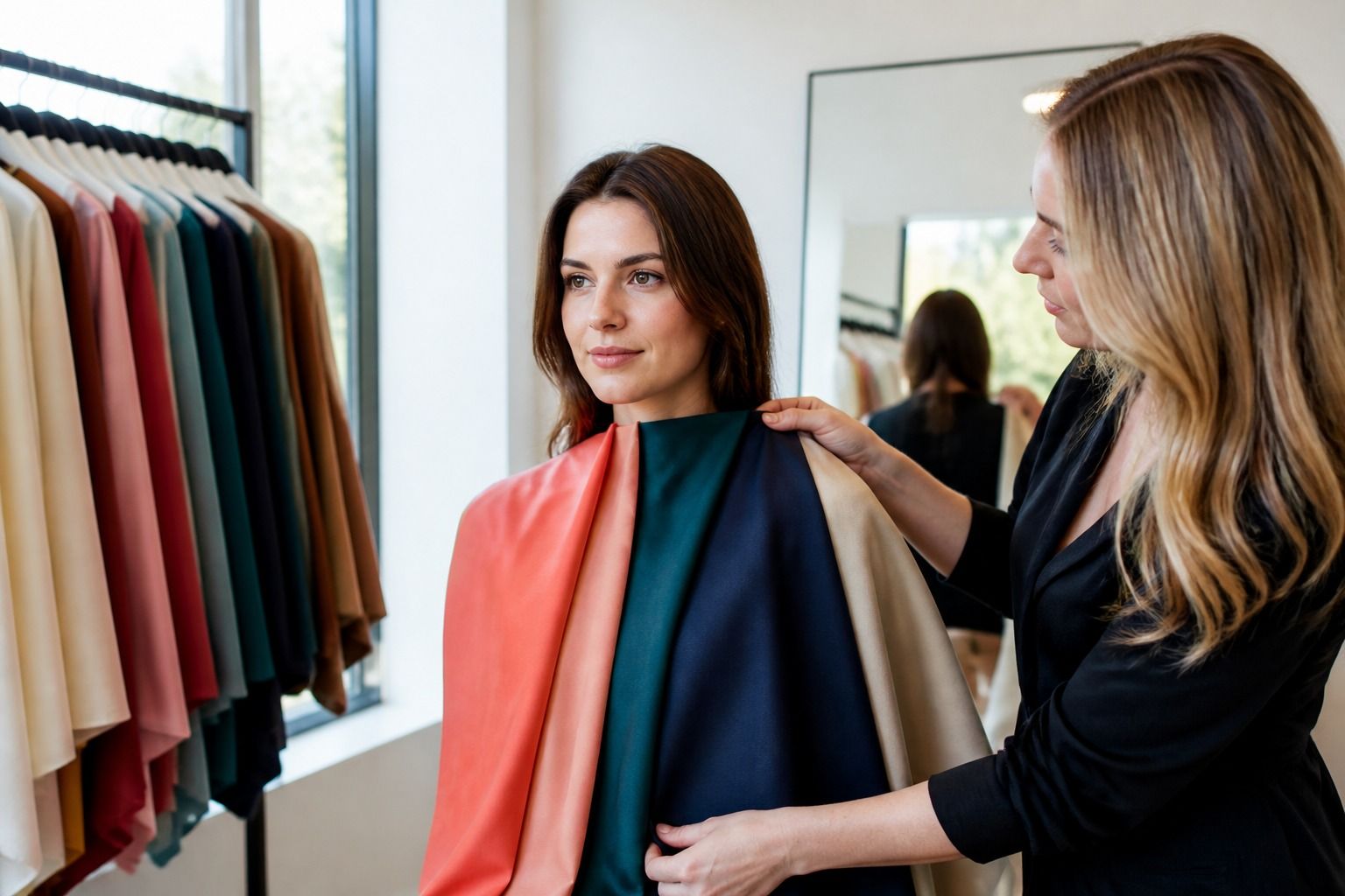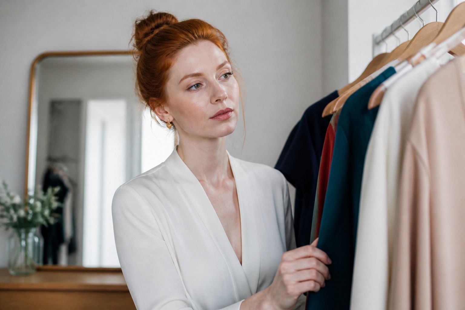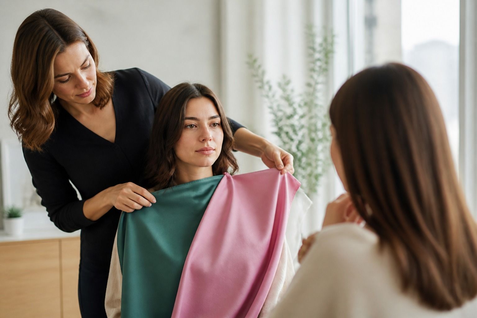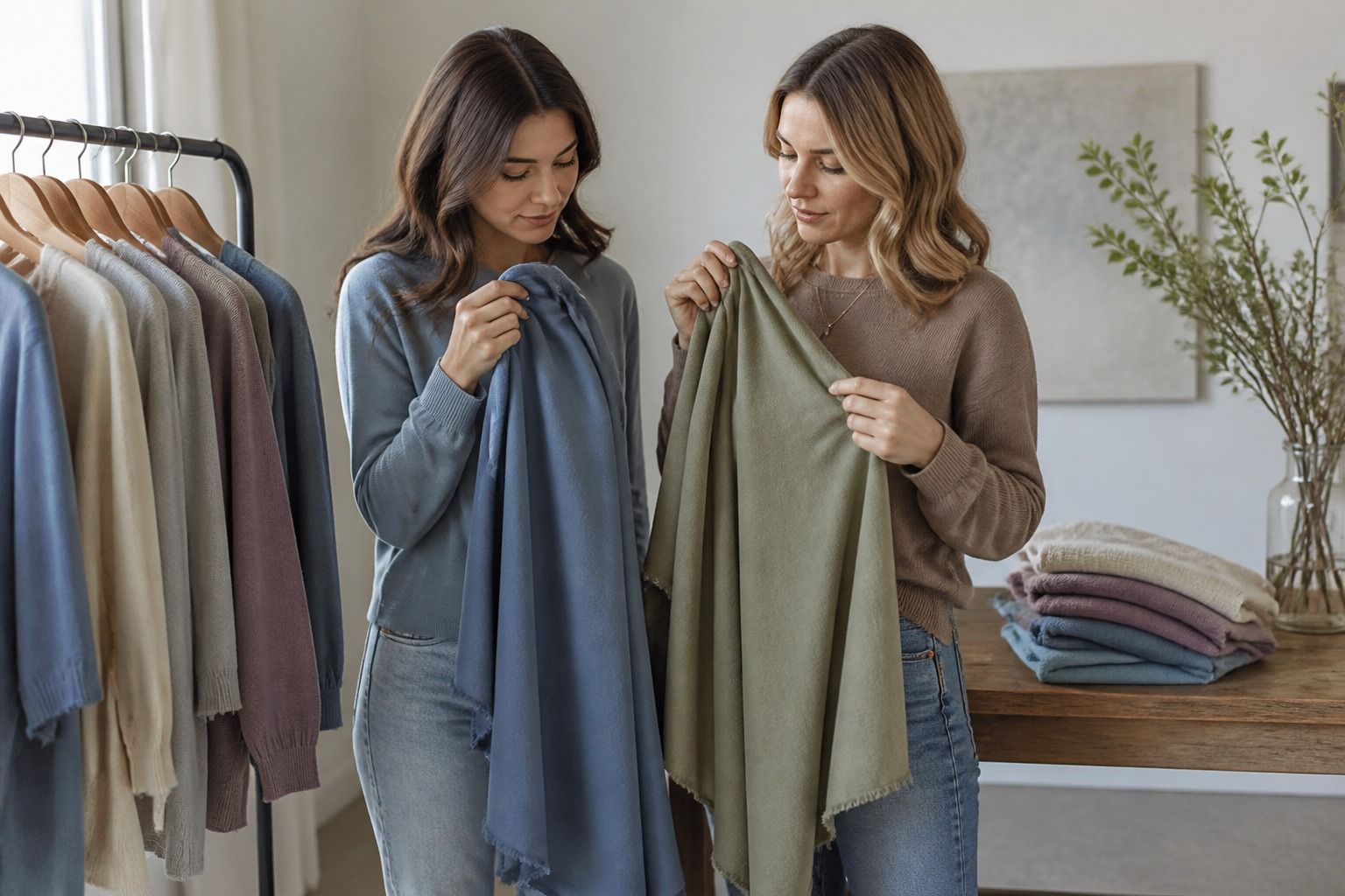
The Soft Summer color palette is made for people who look better when color calms down a little. The best shades are cool or neutral-cool, softened with grey, and close enough in intensity that nothing jumps out before the face does. If bright fuchsia, black, and sharp white make you look tired, but beige and rusty camel feel too warm, Soft Summer is worth testing in real fabric.
What makes Soft Summer look muted
Soft Summer sits in the quieter part of the Summer family. The temperature is cool, but not icy. The chroma is muted, which means the colors feel mixed with a touch of grey rather than poured straight from a paint tube. Think dusty mauve, blue grey, eucalyptus, soft teal, rose brown, mushroom, lavender mist, and a denim blue that has already been washed a few times.
The easiest practical check is contrast. Place a clear cobalt scarf near your face, then try a hazy slate blue. The cobalt may look exciting on the hanger, but on many Soft Summers it steals the room. The slate blue usually lets the eyes and skin texture come forward. This is why the soft summer color palette often looks understated in a flat digital chart and surprisingly expensive in clothing.
Low contrast does not mean pale only. A Soft Summer can wear medium depth beautifully: smoked navy, cool taupe, muted plum, and soft charcoal can all work. The problem begins when the color becomes either too clean or too warm. A clean berry can feel separate from the face. A golden olive can make the skin look slightly sallow. The sweet spot is color with a cool breath and a blurred edge.
Choose colors that sit close in intensity
A useful Soft Summer wardrobe usually starts with neighboring colors rather than dramatic opposites. Dusty rose with mushroom, soft teal with blue grey, lavender with slate, or muted raspberry with charcoal all keep the same quiet pressure. None of these pairings are bland when the fabrics have texture: brushed cotton, matte silk, fine wool, ribbed knit, faded denim, or suede can carry the softness without making the outfit look sleepy.
When choosing prints, look for edges that feel softened. A watercolor floral, a misty plaid, or a low-contrast stripe is easier than a black-and-white graphic pattern. If the print has cream, warm tan, tomato red, and ink black all at once, it will probably fight the palette. If it has misty blue, rose, grey, and a little muted green, it is much more likely to blend with the wearer.
Makeup follows the same rule. A rose-brown lip, soft berry stain, grey-brown liner, and muted mauve blush tend to sit naturally. A coral lipstick may look cheerful in the tube and oddly separate on the face. Pure black mascara can work for some people, especially with darker hair, but soft black, charcoal, or deep grey-brown often looks less severe in daylight.
Compare Soft Summer with Soft Autumn
The border with Soft Autumn causes the most confusion because both palettes are muted. The difference is temperature. Soft Summer keeps a cool or neutral-cool base; Soft Autumn leans warm and earthy. If both dusty mauve and moss green look possible, test them next to the skin in natural light, not under a yellow bathroom bulb. The right palette usually makes the whites of the eyes look clearer and the skin more even without needing extra makeup.
| Test area | Soft Summer direction | Soft Autumn direction |
|---|---|---|
| Best neutrals | Mushroom, cool taupe, blue grey, soft navy | Warm taupe, oat, olive, camel, muted brown |
| Pink and red | Dusty rose, mauve, muted raspberry | Salmon, terracotta rose, warm brick |
| Green | Eucalyptus, sage with a blue cast, soft teal | Moss, olive, muted khaki |
| Metal impression | Soft silver, pewter, brushed white gold | Antique gold, bronze, muted brass |
A good comparison garment is a sweater or scarf because it creates a large color field near the face. Soft Autumn camel may make a Soft Summer look flat or slightly yellow around the mouth. Soft Summer mushroom usually looks calmer. On the other side, a true Soft Autumn can look drained in blue grey and healthier in a warm oat or moss.
Find wearable neutrals and denim
Neutrals are where a Soft Summer palette becomes useful rather than decorative. Black is often too hard, especially in a high neckline. Optic white can create a chalky edge. Better choices are soft navy, smoked charcoal, pewter, dove grey, mushroom, cool taupe, and off-white with a grey or pink cast. These colors still read polished, but they do not create a heavy frame around the face.
Denim is usually friendly to Soft Summer, as long as the wash is not too yellow or too stark. Faded blue, grey-blue, stormy mid-wash, and soft navy denim are easy. Very dark ink denim can work as a bottom, but near the face it may need a softer top or scarf. Acid wash and warm vintage blue are less reliable because they can push either too sharp or too yellow.
If you are rebuilding a wardrobe slowly, start with one neutral column: a cool taupe trouser, a blue grey knit, and a soft navy coat, for example. Add color through a dusty mauve tee, a muted teal blouse, or a rose-brown bag. This keeps shopping decisions less emotional. You are not hunting for every beautiful color; you are checking whether each piece can sit with the quiet neutrals you already wear.
Keep the palette from becoming flat
The main risk for Soft Summer is over-softening everything until the outfit loses shape. The fix is not bright color. It is value, texture, and clean placement. A smoked navy belt, a charcoal boot, a pewter button, or a slightly deeper berry lip can give the look enough definition. The colors still belong to the soft summer palette, but the outfit has a spine.
Use light, medium, and deep versions of the palette in the same outfit. A misty pink blouse with grey trousers may feel gentle but unfinished. Add a slate coat or soft navy cardigan and the whole thing looks more intentional. In summer, the same idea might be an off-white linen shirt, faded denim, and a muted raspberry sandal or bag.
Hair color matters too. Ash brown, cool beige blonde, dark blonde, soft grey, and muted brunette shades tend to cooperate with the palette. Very warm highlights can make the clothing look cooler by comparison, which may or may not be flattering. If your hair is warmer than your best clothing colors, bridge the gap with neutral makeup or a neckline color that is neither icy nor golden.
How to use the palette in real life
Do not treat the Soft Summer color palette as a cage. Treat it as a filter. If a color looks close but not perfect, ask what is wrong with it: too warm, too bright, too dark, or too clean. That one question is more useful than memorizing fifty swatches. A muted raspberry that is slightly deep may be easier to wear than a textbook lavender you simply dislike.
The best proof is a small capsule worn for a normal week. Try two quiet neutrals, two muted colors, one deeper anchor, and one metal finish. Look at phone photos taken by a window, not only mirror impressions. If the outfits look calm but not dull, and your face reads before the clothes, the palette is doing its job.