Personal color analysis is useful only when it survives Tuesday morning: the bad bathroom light, the jacket you already own, the lipstick you forgot you bought, and the black trousers that are still doing half the work. A good palette should make those ordinary choices easier. It should explain why one cream shirt looks soft while another turns gray on you, why a berry lip feels right with a bare face, or why a warm camel coat looks expensive on your friend and tired on you.
What the analysis is meant to answer
The point is to reduce friction in your closet. A useful personal color analysis answers a few plain questions: do cooler or warmer colors sit better against your skin, do you need light or deep colors near your face, and can you handle clear color or do softer, muted shades look more believable?
That sounds simple until you compare real fabric. A white shirt, an oatmeal knit, a charcoal blazer, and a tomato red scarf can all behave differently on the same person. One color may make the skin look calmer, while another creates shadows around the mouth or makes the eyes look flat. I trust those small reactions more than dramatic before-and-after claims.
Seasonal color analysis gives names to those patterns: Spring, Summer, Autumn, Winter, plus softer or deeper subgroups in expanded systems. The names are shortcuts. If a result says Soft Summer, it usually means cool leaning, muted, and medium-light colors. If it says Deep Winter, it points toward cooler, darker, clearer colors. The useful part is the direction, because direction is what helps you shop.
Start with undertone, value, and chroma
Three parts do most of the work: undertone, value, and chroma. Undertone is the warm-to-cool direction. Value is how light or dark a color is. Chroma is how clear or muted it feels. When people get stuck, they often argue about undertone for weeks while ignoring the other two, which is how a cool person can still look washed out in icy blue or a warm person can still struggle with golden beige.
Check undertone with color families, not isolated jewelry tricks. Compare a soft rose against a warm peach, a blue red against an orange red, a cool taupe against camel. Use daylight near a window, remove heavy makeup if possible, and keep the background boring. Bright bathroom bulbs, green walls, and phone filters can turn a decent color analysis online into a guessing game.
| Feature | What to compare | What a good match usually does |
|---|---|---|
| Undertone | Rose vs peach, blue red vs orange red, taupe vs camel | The skin looks calmer and the color seems connected to the face |
| Value | Ivory, medium gray, charcoal, espresso | The face stays visible instead of being drained or overpowered |
| Chroma | Clear cobalt vs smoky blue, bright coral vs muted terracotta | The color has energy without looking louder than you |
A color palette analysis gets much easier once you separate those traits. Maybe your skin likes coolness, your hair needs medium depth, and your overall coloring cannot take very sharp contrast. That is a different wardrobe from someone who is also cool but needs black, optic white, and jewel tones to look alive.
Use draping instead of judging swatches in your hand
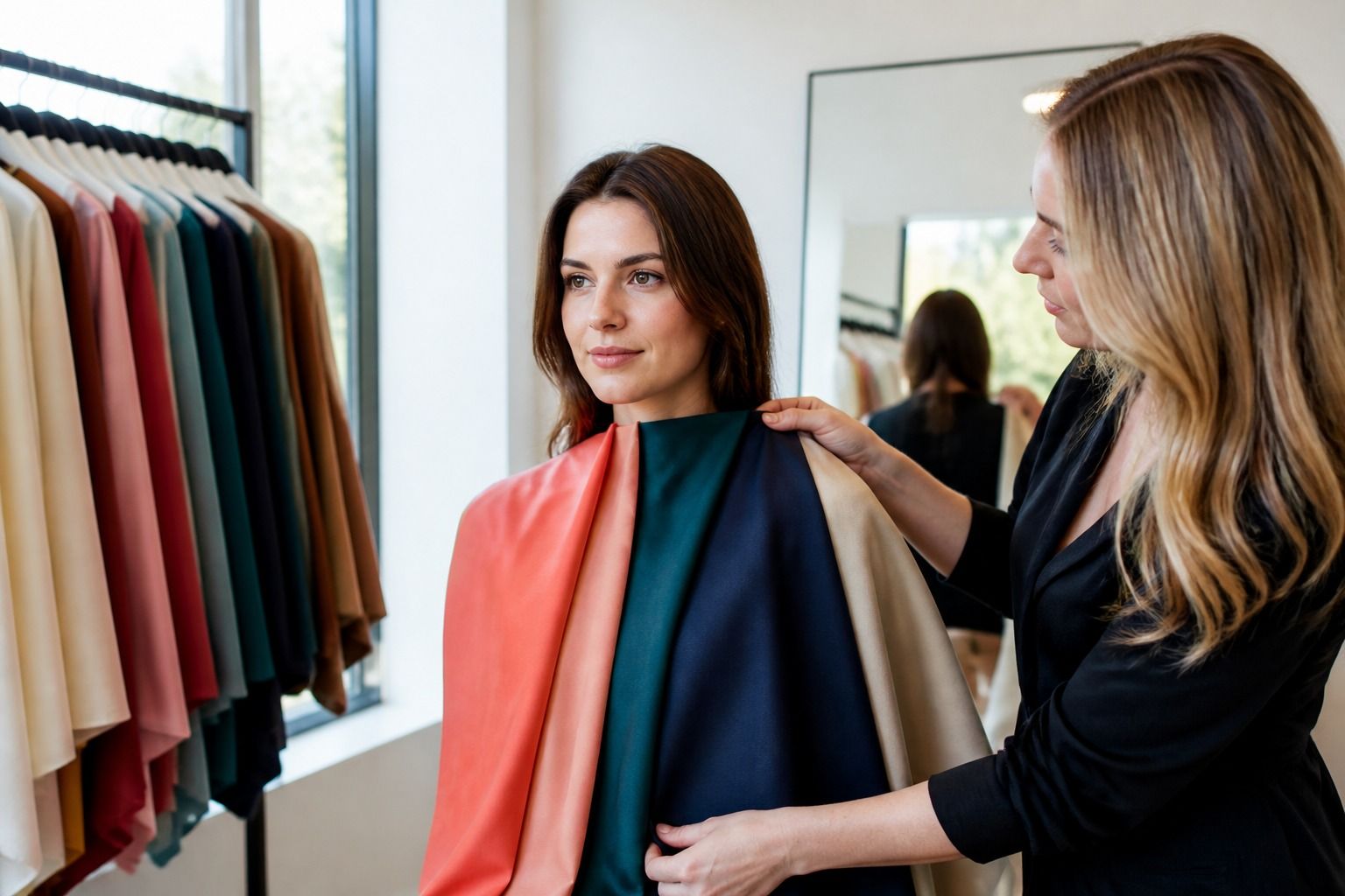
Swatches are tidy. Faces are not. Hold fabric under your chin and look at the face first, not the color. If you keep admiring the scarf, you may simply like the scarf. If your eyes sharpen, redness calms, and the edge of the jaw looks clearer, the color is doing something useful.
Try pairs. Cream beside optic white. Navy beside warm brown. Dusty lavender beside clear violet. Soft sage beside emerald. You do not need a professional draping kit to learn from this. A clean T-shirt, a pillowcase, a scarf, or a jacket can be enough if the fabric color is honest and large enough to reflect onto the skin.
Photos can help, but they can also lie. Auto white balance will correct the scene and flatten differences. If you take pictures, keep the camera position, light, exposure, and background the same. Do not compare one photo taken by a sunny window with another taken under a warm ceiling lamp at night. That is lighting analysis.
Turn a result into an everyday palette
The most wearable palette is smaller than the full seasonal fan. Pick a base neutral, a soft neutral, two everyday colors, one stronger accent, and one version of white. For many people, that tiny edited set changes more than a page of eighty swatches. It tells you what coat to buy, which T-shirts to repeat, and which lipstick family is worth testing again.
If your analysis points cool and muted, you might build around charcoal, soft navy, mushroom taupe, dusty rose, blue-gray, and muted berry. If it points warm and rich, olive, espresso, warm ivory, rust, teal, and deep coral may make more sense. If it points bright and high contrast, black, optic white, true red, cobalt, emerald, and hot pink may feel normal rather than theatrical.
Do not throw out everything that sits outside the palette. Start near the face: tops, scarves, glasses, earrings, lipstick, blush, and hair color. Trousers, shoes, bags, and belts can be more flexible. A black skirt may stay even if black is not your best face color; a black turtleneck is a different question.
Where online analysis needs a reality check
Colour analysis tools online can be useful if they ask for clean photos and explain uncertainty. They get weaker when they promise a season from one selfie with makeup, indoor lighting, and a colorful wall behind you. The skin, hair, and eye contrast may be readable, but undertone is fragile in bad light.
Use online results as a hypothesis. If the answer says Cool Summer, test cool muted colors against your actual clothes. If the answer says Warm Autumn, check whether warm olive, camel, rust, and cream improve the face in daylight. A result that cannot survive fabric is decoration.
Borderline people need more patience. Neutral undertones, dyed hair, rosacea, strong tanning, and very high or low contrast can blur a quick test. In those cases, the best clue is often the repeat pattern across many colors. One flattering blue does not prove a season. Ten colors that all share coolness, softness, and medium value begin to tell a story.
How to keep the palette useful after the first week
A palette works when it changes what you buy less often. Keep notes on the clothes that get compliments without effort. Notice the sweater you wear when you are tired, the lipstick that works with no other makeup, the shirt that makes your hair color look deliberate. Those are better clues than a perfect digital fan you never use.
When shopping, compare new items to your best existing pieces. Put the new blue beside the navy jacket that always works. Hold the beige knit next to your best white. If the new color makes the old reliable piece look dirty or disconnected, ask why. It may be too warm, too cool, too light, too deep, or too clear for the palette you are building.
The goal is a closet where the surprises are chosen on purpose. Keep the colors that make your face look present, keep a few exceptions because style needs oxygen, and let personal color analysis do the boring job it does best: making everyday outfits easier to assemble.