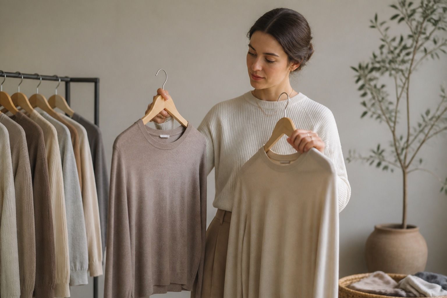
Neutral undertone colors are often described as easy, but neutral does not mean every shade behaves the same way. When the warm-cool difference is balanced, the deciding factors may move to depth, softness, contrast, and the amount of color near the face. A useful palette gives you stable choices without forcing you to live in beige.
How neutral undertone behaves in clothing
Neutral coloring can sit comfortably beside both warm and cool shades, but the strongest options usually share another quality. A soft neutral may need a soft color beside it; a deep neutral may look better with enough contrast; and a bright color may need a clean neutral to keep the outfit from becoming noisy. Temperature is part of the decision, not the whole decision.
Start by comparing balanced versions of familiar colors: stone with warm beige, soft navy with black, mushroom with camel, or blue-grey with taupe. Watch the face rather than the garment. The better color often makes the skin look steadier and the eyes more present, while the weaker one creates a yellow, grey, or overly pink reflection.
Choose neutrals by value and softness
A wardrobe built around neutral undertone colors still needs a light, medium, and dark range. Ivory, oatmeal, stone, mushroom, grey, soft navy, and chocolate can all be useful, but the right combination depends on your contrast. If the face has low contrast, a very hard black-and-white pairing may take over. If the features are deeper or clearer, an outfit made entirely of pale beige may look unfinished.
Fabric changes the impression. A matte taupe reads quieter than a shiny taupe; a brushed grey appears softer than a crisp grey; and a warm brown can look cooler when it is deep and desaturated. Test the actual material you plan to wear. Color names on a product page rarely tell you how much light the fabric will throw back at the face.
Find colors that stay balanced near the face
For tops, scarves, and jackets, choose colors that do not create a strong cast in daylight. Compare a warm and cool version at the same depth, such as dusty rose with muted peach or sage with blue-green. If one is flattering only from a distance, it may be better below the waist or broken up by a neutral neckline.
Neutral undertone does not require a perfectly neutral wardrobe. It simply gives you room to test both directions. Keep a small set of reliable near-face colors and use warmer or cooler accents when they create the mood you want. The palette becomes more interesting when its balance is intentional rather than when every item is carefully middle-of-the-road.
Use stronger accents without turning harsh
A balanced undertone can carry stronger color, but intensity still matters. If a bright red looks too sharp, try a deeper berry or a softened brick. If a pale blue disappears, choose a clearer medium blue rather than automatically choosing a darker shade. Moving one dimension at a time makes it easier to understand what the face is responding to.
Keep strong accents close to a color that explains them. A clear teal can sit beside ink navy; a warm red can be grounded by charcoal; and a saturated purple may need a quieter grey rather than another loud color. These combinations preserve personality while keeping the outfit from competing with the face.
Build a small neutral-friendly wardrobe
Choose two light neutrals, two medium neutrals, one dark anchor, and four colors that can be mixed with at least two of them. This is enough to create variety without collecting every possible shade. If the palette is neutral undertone colors for work, make sure the dark anchor works with the shoes and outerwear you already own.
Keep a note of colors that look good but are difficult to use. They can remain as occasional accents rather than becoming a shopping priority. The best palette reduces decisions: you should be able to pick a neutral, a supporting color, and one detail without wondering whether the undertone rules have been broken.
When a neutral result still feels uncertain
If every warm-cool comparison looks acceptable, look at contrast and chroma next. A muted person may prefer softened colors in both directions; a clear person may need cleaner edges; and a deep person may need more visual weight even when the temperature is balanced. These observations often explain why a neutral palette feels right in one outfit and flat in another.
Keep the rule flexible and test it over time. A neutral undertone color palette should make it easier to choose clothing, not create a new source of doubt. Save the combinations that repeatedly work, use the less certain shades farther from the face, and let actual wear decide what deserves a permanent place.
A simple way to rank the palette
Put each candidate color into one of three groups: easy near the face, useful with a layer, or better kept away from the face. This ranking is more useful than calling a shade universally flattering. It also respects the fact that a neutral undertone can carry different colors depending on depth, fabric, and the amount of contrast in the rest of the outfit.
When two colors are close, choose the one that pairs with more of your wardrobe. A neutral taupe that works with navy, berry, olive, and denim is a better purchase than a very specific beige that needs one exact brown. Practical color analysis includes the cost of making an outfit work.
Review the list at the end of a season. Keep the neutrals that were easy to repeat, move the difficult accents to accessories, and replace only the gaps that made dressing slow. A small neutral-friendly wardrobe should feel balanced and flexible, not like a set of restrictions.
Take a reliable neutral with you when shopping. It gives the eye a fixed point and makes it easier to compare a new taupe, grey, or beige without relying on a changing store mirror. If the new shade makes the reference look yellow or dull, move it away from the face and test a different version.
A reference piece also helps when shopping online. Place the garment beside a known color in daylight after it arrives and check whether the difference is temperature, depth, or fabric finish. This is more reliable than trusting names such as natural, nude, stone, or sand, which can describe very different dyes.
Keep the palette generous enough to live in. Neutral undertone colors should help you combine clothing, not make every purchase feel like a technical decision. Once the pattern is clear, use it quietly and let the rest of your style do the interesting work.